
Hi all, Merry Christmas! Experimenting with posting a slightly different type of content for the Holidays.
There has been a lot of hype recently about Artificial Intelligence and data science as the next frontier for humanity’s progress. A quick Google search on either term will yield numerous courses and tutorials from beginner to expert levels. The number of applications for AI is so broad, it can be overwhelming. Deep learning and generative AI (thanks to ChatGPT) are probably going to be some of the biggest buzzwords next year. However, while AI is an extremely powerful and useful tool, it still needs to be evaluated in an objective, scientific manner before use. For that, we need to be able to interpret an AI model through interpreting its performance using skills such as data visualization. This is why I think learning the fundamental skill of how to plot, interpret, and communicate data is highly underrated, and should be the first skill to be learned in any data science course.
So here are some ways data visualization can help your research, as well as a few resources that I have found helpful when learning data visualization myself.
Just as a note, I write these opinions as a career researcher with a background in biology (and later pharmacy), and self-taught data science skills from the internet (thanks stackoverflow). My opinions are mainly geared toward others who are also in biology and might be keen on exploring a research career.
How data visualization can help us
- Learning to plot our data can help us identify trends
Let’s use this number table as an example. What trends do you see?
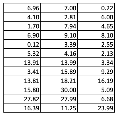
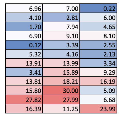
It probably took a bit, but you might have observed that the values in the lower half of the table tend to be bigger than those in the upper half of the table. However, if we did some conditional formatting, we can see this trend a lot faster. Red cells have higher values than blue cells.
2. Plotting can help us better visualize and interpret the differences between groups
Now, just looking at a random data matrix alone is no fun. Let’s add some labels.
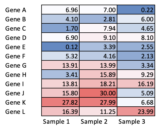
This is a mock example of a heatmap, a very common visualization tool used to interpret gene expression of a panel of genes across different samples. Sample 1 and 2 have more highly expressed genes than sample 3.
Just a note, these are not actual data, but rather, randomly generated “expression data” for illustration purposes, where the higher the number the more highly the gene is expressed so please pardon the weird values.
3. Plotting helps us to tell our scientific story
However, without a scientific question, or even knowing what these samples are, there isn’t much meaning to the interpretation. Labelling your figures well is an important part of telling a scientific story effectively. If we had a scientific question e.g. which genes are highly upregulated in disease compared to a healthy person, and we know that sample 1 and 2 were taken from diseased patients while sample 3 was from a healthy control, then we can easily interpret the heatmap. From the heatmap, we can see that genes G, I, J and K are upregulated in disease and further hypothesize how they might be contributing to disease.
Of course, other considerations such as sample size to be taken into consideration as well before we can confidently make the claim about which genes are more highly upregulated. But this is for teaching purposes, so bear with me.
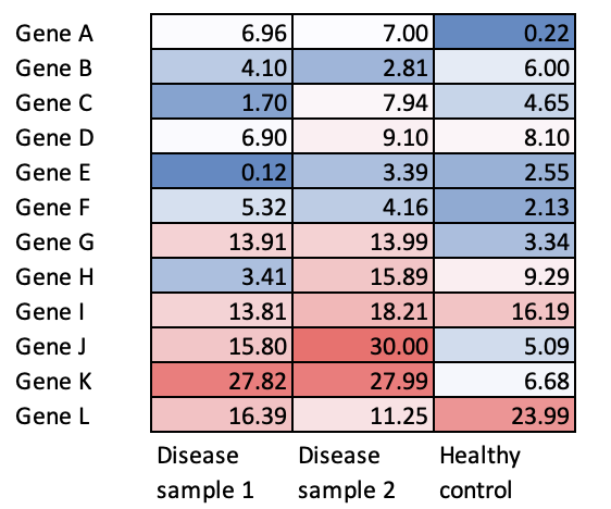
In this example, I have merely done some conditional formatting using a color scale to a data table in Excel, but our interpretations from the original unlabelled data table are highly different. We have also been able to craft a scientific story about genes upregulated in disease compared to healthy control. This highlights how even simple data visualization can help identify trends, interpret and communicating our data across to our audience. There are of course many other types of visualization you can use, which is why I decided to share some resources below.
How to learn data visualization
- Start with a research question in mind
There are probably more than 100 types of data visualization, and probably more than 100 ways to plot a similar kind of graph. Not to mention, there are multiple different programming languages you can use to plot a graph. Over my own years of trial and error, I have found it much more productive to learn data visualization skills specific to a project, rather than to go through tutorials teaching general concepts. It allows you to stick to a single language and have a few types of graphs as a targeted goal to learn, so you truly get equipped with the skills needed for your work.
To start, ask yourself
- What is the main research question you are asking?
- What kind of datasets do you have?
- How can the datasets help to answer the research question?
From there, it will be easier to figure out what kind of result you want, and therefore what kind of graphs you want to plot.
2. Useful resources for plotting
As a pharmacometrician and data integrator, I primarily use R for my research work. For that, I tend to refer to https://r-graph-gallery.com to get ideas on what kind of plots can I use to explore my data. Referring to available literature online for what kind of graphs others have used to illustrate similar points too can be helpful.
For errors that come up, I find that googling the error helps too, and most answers come from stackoverflow.com forum discussions where others may have encountered similar errors.
For a good basic tutorial on R fundamentals https://datacarpentry.org/R-genomics/01-intro-to-R.html has a good introduction on how to create objects, wrangle data, and of course, plot graphs.
3. Practice, practice, practice
Learning how to craft a clear, easy-to-interpret plot sounds really simple, but in reality, can take a lot of time and effort to master well. Do not be disheartened when you start to run into errors. Good data visualization doesn’t usually happen at the push of a button. This is why people like me have full time jobs to consistently write things, troubleshoot and do things with lots of trial and error too! As you gain more experience, you should be able to troubleshoot and produce visualizations faster too.
Also, ask people e.g. your co-workers, lab mates, or scientific mentors for feedback, if they find your plots easy to understand. As a new grad student, I learned the hard way that what was obvious to me in my plots, was not always apparent to others. It has taken many rounds of iteration of the same plot for me to come up with easy-to-interpret graphs that even lay audiences can easily understand in a short presentation. This is why effective science communication itself is a whole art form!
In this post, I have shared how data visualization can be useful to help us plot, interpret and communicate data, as well as some resources on how to get started with data visualization. Do hope this sharing helps!
