We all respond to drugs differently. As many of you have pointed out while using the coffee simulator https://janicegoh.shinyapps.io/CoffeeSimulator/ over the past few months, the profile shown there does not always accurately describe your experience with coffee. This is because while the coffee simulator describes the population average, we are all unique individuals. Our response can thus be influenced by a variety of factors, from age, gender, concomitant medication, genes etc. An emerging field that has gained prominence in recent years to help explain this variability is pharmacogenomics – the study of how changes in the genes coding for drug metabolizing enzymes and transporters can influence how much drug is absorbed and cleared. Before starting certain drugs, knowing the pharmacogenomic make up of a person is important, to ensure that they get the appropriate dose and therapy.
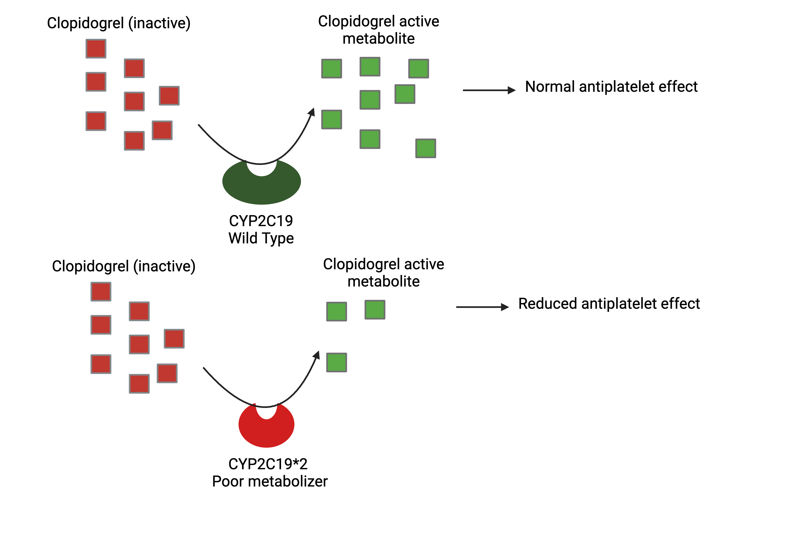
For survivors of a heart attack, it is common to be prescribed clopidogrel, an antiplatelet medication, to prevent further heart attacks. Interestingly, clopidogrel is a prodrug, which means it needs to be metabolized by drug metabolizing enzyme CYP2C19 before it can become effective. A gene coding for CYP2C19 with less activity (aka poor metabolizer) is thus bad news for patients on clopidogrel. This can pose as a problem in Singapore, as 43.8% of our population have decreased CYP2C19 function, while 13.7% have no CYP2C19 function at all (https://rdcu.be/dGZIA). Clopidogrel might thus be not as effective in preventing blood clots as we would like it to be. Per CPIC guidelines, an alternative therapy should be considered instead for people with reduced function CYP2C19 polymorphisms.
If you happen to be on this medication however, please do not stop clopidogrel because you have read this post. Please always consult your doctor/pharmacist for informed treatment decisions before deciding to start or stop a new medication.
The need for alternative therapy from clopidogrel for patients with decreased or no CYP2C19 function is just one example of how pharmacogenomics can be used to help us better tailor medications, especially here in Asia, where our genomes are still understudied.
To a person new to PK modeling, understanding the differences between population PK modeling (top down) and physiologically based PK (PBPK) (bottom up) modeling might be confusing. Hopefully, this analogy can help you out.
Let’s say you wanted a new cabinet in your house. How would you go about doing so?
The most apparent way would be to measure out the dimensions of the room you want the cabinet in and hire a carpenter to tailor make one for you. This is like (top down) population PK modeling, where we fit the model directly to the data.
If for some reason, however, you cannot measure your room dimensions, how then can you go about getting the right cabinet? One possibility would be to ask your neighbour, whose house floor plan is similar, what model their cabinet is. You can then buy the same model from the furniture store. This is akin to using a popPK model from literature instead of collecting your own data, if you can assume that the population used to develop the model is similar enough for your purposes. I do use these models as the basis to build PK-PD models where appropriate.
However, if your neighbor does not allow you to reference their house (no popPK model from literature available), and the carpenter is unavailable (cannot collect PK data to build the popPK model), we can try to build it ourselves, using prior knowledge of how a cabinet should be built. You must gather wood, screws, and hinges. Based on your knowledge of how cabinet doors and drawers work, and the standard sizing of a cabinet in a house model like yours, you can build a cabinet with reasonable knowledge that it should fit into your room. This is (bottom up) PBPK modeling, where the PK model is built based on the drug’s physicochemical properties, as well as our knowledge of human physiology.
There are other options too, that include a blend of the methods, but I will save that for another time.
Hi all, life has been pretty busy lately, but I am still trying to post fun things I come across when I can. Hope you enjoy!
A common but relatively harmless side effect of metformin is a lingering metallic taste that won’t disappear. While it might be easy to think this is because the drug has somehow altered the taste receptors on our tongue, the actual reason is much more surprising.
In this research study by Nora Lee et al. (PMID: 25107910), they discovered that metformin accumulates in salivary glands due to a drug transporter, organic cation transporter 3 (OCT3). OCT3 acts like a selective pump, bringing metformin in from the blood and pushing it into the salivary gland. When saliva comes out in the mouth, we can thus taste metformin again, resulting in the metallic taste.
To alleviate this metallic taste, we thus recommend drinking more water or taking sugar free sweets. Most patients on metformin do report, however, that they get used to the medication over time and become less bothered by it. However, for patients who do feel their quality of life is impacted by metformin’s side effects, it is worthwhile talking to a doctor or pharmacist about it, as there are alternative medications that can be taken to control diabetes instead.
As a Singaporean Chinese, I grew up taking a mix of both Traditional Chinese Medicine (TCM) and Western medicine when I fell sick. In particular, one of my favourite medicines a TCM cough medicine, Pipagao. Pipagao is a honey-based, herbal cough syrup flavored using loquat (or Pipa in Mandarin, giving it its name), that is highly soothing for sore throats. Due to the fact that Pipagao tastes good compared to a lot of cough medicines and does not have the unwanted side effect of drowsiness that comes with many Western cough syrups I often recommend Pipagao as a good symptomatic relief for dry cough and itchy throat. (#notsponsored)
There is one particular exception, however, where I will not recommend Pipagao. For patients on warfarin, taking Pipagao can be highly dangerous. Warfarin is an oral anticoagulant used to treat and prevent blood clots. Warfarin is also a drug with a narrow therapeutic index and thus needs to be titrated carefully with frequent follow up by healthcare providers when first prescribed, in order to maintain good efficacy without putting the patient at too high a risk of uncontrolled bleeding. Aside from the dose given, warfarin efficacy can be influenced by a myriad of factors, with one of the significant ones being diet, including supplements and herbal remedies. Pipagao is unfortunately one of the herbal medications known to significantly decrease the efficacy of warfarin, and can thus lead to unwanted outcomes such as further blood clotting and even stroke.
Why, and how exactly does this happen?
As Pipagao is a mix of herbal ingredients, a number of answers are possible and the answer is unfortunately not very clear cut. As a pharmacologist, I have broken this interactions down into 2 possible theories.
Theory 1. Pipagao contains a large amount of vitamin K (Pharmacodynamic herb-drug interaction)
In this theory, we hypothesize the warfarin-pipagao interaction is a pharmacodynamic herb-drug interaction, meaning that Pipagao contains ingredients that act along the same pathway that warfarin acts on. Warfarin prevents blood clotting by reducing the amount of vitamin K available to make clotting factors. As many herbs and leafy vegetables are known to be good sources of vitamin K, we can thus hypothesize that Pipagao as a herbal blend, contains a large amount of vitamin K. The large amount of vitamin K thus negates warfarin’s action, making warfarin less efficient in preventing clotting. During my research on this topic however, I was not able to find much information on the vitamin K content of the various ingredients in Pipagao, as vitamin K is generally not an essential nutrient and is thus not as widely quantified and reported in many consumer products. This makes theory 1 highly plausible in terms of known mechanism. But without actual evidence of the vitamin K content of Pipagao, it is hard to make a definite conclusion.
Theory 2. Pipagao contains ingredients, such as licorice, that induce warfarin breakdown (Pharmacokinetic herb-drug interaction)
In this theory, we hypothesize that Pipagao contains ingredients that hasten the breakdown of warfarin, causing warfarin to be present at levels lower than expected within the body instead. This is could be due to 甘草 (licorice), which has studies showing its capability of inducing liver enzymes that metabolize warfarin, such as CYP3A4 (PMID: 25640094). An increased amount of drug metabolizing enzymes can thus lower warfarin levels, rendering it less efficacious than expected.
While the mechanism of interaction is still up for debate, caution should be taken when a person on warfarin wants to consider taking a herbal medication, as it could greatly alter the efficacy of warfarin.
Both theories, pharmacodynamic (warfarin’s reduced vitamin K antagonism) and pharmacokinetic (warfarin’s reduced drug levels) are plausible as a mechanism of interaction. Which one do you think it is? Let me know in the comments!
Hello friends, here’s a fun question for you. How many oranges do you need to eat to get the same amount of vitamin C as a 1000mg vitamin C tablet?
A quick Google search suggests that a single orange has about 70mg of vitamin C. So by using pure math alone, we will approximately need to eat 14 oranges to get the same amount of vitamin C as the tablet… However, we have yet to factor in the concept of bioavailability, or the proportion of a drug or other substance that enters the circulation when introduced into the body and so can have an active effect.
This paper by Blanchard J et al. (PMID: 9356534), illustrates nicely how vitamin C has dose dependent bioavailability.
This means that the higher the dose, the lower the amount of vitamin C that can be absorbed into the body. This suggests a 1000mg dose of vitamin C will give you only about 200mg of bioavailable vitamin C in actuality. This is much less than what we initially started with.
As a pharmacometrician, I could suggest you split the 1000 mg dose of vitamin C over 4 or more times throughout the day to improve the bioavailability and thus absorption. However, as the general vitamin C intake guidance is 90mg for men and 75mg for women, it might not be as worthwhile to go through the trouble. 🙂
Fun fact, as Lunar New Year is coming up soon, I found that tangerines (aka mandarin oranges) contain less vitamin C, with about 32mg of vitamin C for a large tangerine, compared to 70mg in an orange. I like tangerines because they are sweeter though, so I will be eating lots soon 🙂
Good morning. In today’s weather report, we are expecting 1000L rain. – said no one ever.
If I were to read the weather report before going to work, I intuitively want to know 3 things: the location the rain will cover (location – does this affect my commute?), how heavy the rain will be (rate: how fast and how much rain is falling? will I get drenched?), and how long it will last (duration: should I wait for the rain to stop before I go out?). From the weather app, I am told to expect scattered showers from 8am to 10am around where I live. I thus pack my foldable umbrella in my bag and head out.
Granted, to take a tablet, it is more convenient to simply know the amount, e.g. 1000mg. (no one consumes paracetamol at 100mg/min.) However, to optimize a dosing regimen, we also need to know similar things to the weather report such as
How much drug gets to the site of action? (location)
How fast is the drug absorbed and eliminated? (rate)
How long will the drug last in the body at a therapeutic concentration? (duration)
To answer these questions, we cannot simply rely on dose alone. We have to understand absorption (how fast and how much of the drug is absorbed), distribution (where does the drug go), metabolism and elimination (which together tell us how long the drug will last in the body). (Or ADME, for short) These processes work together to tell us how much drug is in the body and how long it will remain. This gives us a much better picture of how much drug to give.
Hope this short sharing allowed you to learn some PK on your commute!
Hi all, I’m Janice, your SG pharmacometrician. To many of you, pharmacometrics, the study of modeling and simulation of drug levels and their outcomes, probably isn’t a term that comes easily to mind or something that you will regularly come across in daily life. However, a model of a very similar nature exists almost everywhere around us. It is a default app on our phones and laptops, and we will check it before going outside so we can make decisions about what to wear and whether or not to bring an umbrella. This is the weather forecast.
The weather forecast is useful both on individual and governmental scales. At the individual level, it gives us useful information about the weather for the day and if we should bring an umbrella. Weather forecasting can also help us forecast more serious issues such as water supply via predicted rainfall, and disasters such as flooding or hail, and make preparations for it beforehand. Accurate forecasting can thus help to save lives and minimise property damage.
Weather forecasting isn’t done by magic though. Weather forecasts are made by collecting quantitative data about the current state of the atmosphere, land, and ocean and then projecting how the atmosphere will change. However, the atmosphere is chaotic and not all of its processes are fully understood, making weather forecasting a whole science of its own, with its own complex set of predictive models. Pharmacometrics is also a form of forecasting. Using preclincial data, trial data and real world data, pharmacometric models help to integrate and make sense of the patterns within this data to help us forecast potential therapeutic outcomes too. Just that instead of predicting the weather, we can use it for applications such as predicting an effective dose with new drugs or special populations. We can thus use pharmacometrics to tailor drug doses for individual patients and use it to provide important information about a drug’s dosing, efficacy and safety as an important part of regulatory decision making. With an increasing number of new therapies being developed, and patient care getting more complex, pharmacometrics should thus play an even more important role in helping to make decisions in drug development and the push for precision medicine.
The weather app on our phones is so innocuous we hardly give a thought about the amount of science that goes into it just to give us our weekly weather predictions. Similarly, pharmacometrics work often occurs behind the scenes too and we may not be aware that an increasing number of new medications these days rely on pharmacometricians to help push them into the market as safe and efficacious. The dosing instructions at the back of your medicine bottle was probably recommended by a pharmacometrician! Pharmacometrics is not yet mainstream in Asia, though. With the huge push for precision medicine to care for our own population, I do hope that pharmacometrics will find a place and be an important contributor to save lives.
2023 was a big year of transition for me. Just this year I graduated from UCSF, published a paper, moved from San Francisco to Singapore to pioneer pharmacometrics research as part of the Research Data Integration Group at BII.
One of the biggest challenges has been learning to learn all over again. Toward the end of my PhD, it was easy for me to feel like an expert, being confident and proud of what I had accomplished over the past 5 years of nonstop hard work. Upon starting a new job though, I realized once again that I once again faced a steep learning curve.
My main job as a student was to be able to develop and carry through a project well with guidance from my supervisor. I naively thought that simply gaining expertise with my thesis lab, and learning to develop a clear, feasible scientific project, alongside a little creativity and expertise of my own was sufficient to start a research career. Now that I am starting up my own research, I find that many other factors need to be considered too, such as the bigger overall scientific ecosystem of my institute, and where I can fit in and complement others well with my research. These days, I not only write research proposals but have to learn to network at a different level, pitching my ideas well for collaborations and data, both to experts and nonexperts alike, and building new relationships with a new scientific community. I had to learn to be adaptable too, and have recently started picking up computational multi-omics skills again. I have been learning to use Linkedin more too, and how to build my own website and branding. The list goes on…
I liken this experience a lot to one of my favourite martial art stories about Jigorō Kanō, the founder of Judo. Despite being THE Judo Grandmaster, he requested to be buried with a white belt instead of his black belt, saying, “Because I will enter the next life as I lived this life…wearing my white belt.” While some might dispute whether this event actually occurred, I do think that the philosophy behind it is a well meaning one.
For those not familiar with the martial art belt ranking system, white belts are usually complete novices. The belt colors change over time as you progress, e.g. from white to yellow to orange etc. eventually toward a black belt, which would indicate a certain level of mastery in the martial art. But regardless of ranking, Grandmaster Kanō kept his white belt mentality to consistently hone his craft with humility while being open to learning and re-learning.
A similar thing can be said about my PhD experience. After achieving my degree, I do think I have some level of mastery in my field of study, much like getting a black belt in martial arts. But that constant need to learn and relearn even in science makes me want to put on my white belt again, to keep an open mind and continuously hone my craft.
Happy new year to all! May 2024 be another year of joyous learning and cheers to being a white belt all over again!
Hi all, Merry Christmas! Experimenting with posting a slightly different type of content for the Holidays.
There has been a lot of hype recently about Artificial Intelligence and data science as the next frontier for humanity’s progress. A quick Google search on either term will yield numerous courses and tutorials from beginner to expert levels. The number of applications for AI is so broad, it can be overwhelming. Deep learning and generative AI (thanks to ChatGPT) are probably going to be some of the biggest buzzwords next year. However, while AI is an extremely powerful and useful tool, it still needs to be evaluated in an objective, scientific manner before use. For that, we need to be able to interpret an AI model through interpreting its performance using skills such as data visualization. This is why I think learning the fundamental skill of how to plot, interpret, and communicate data is highly underrated, and should be the first skill to be learned in any data science course.
So here are some ways data visualization can help your research, as well as a few resources that I have found helpful when learning data visualization myself.
Just as a note, I write these opinions as a career researcher with a background in biology (and later pharmacy), and self-taught data science skills from the internet (thanks stackoverflow). My opinions are mainly geared toward others who are also in biology and might be keen on exploring a research career.
How data visualization can help us
Learning to plot our data can help us identify trends
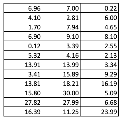
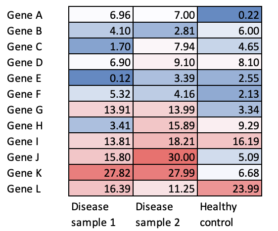
Let’s use this number table as an example. What trends do you see?
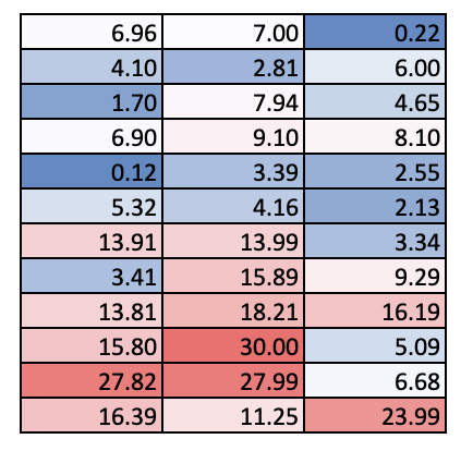
It probably took a bit, but you might have observed that the values in the lower half of the table tend to be bigger than those in the upper half of the table. However, if we did some conditional formatting, we can see this trend a lot faster. Red cells have higher values than blue cells.
2. Plotting can help us better visualize and interpret the differences between groups
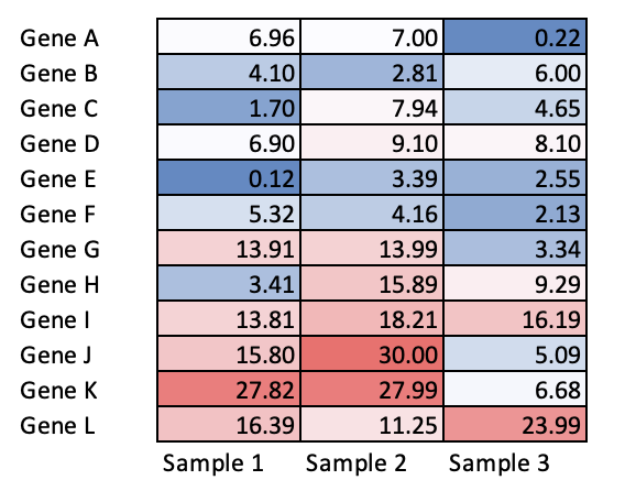
Now, just looking at a random data matrix alone is no fun. Let’s add some labels.
This is a mock example of a heatmap, a very common visualization tool used to interpret gene expression of a panel of genes across different samples. Sample 1 and 2 have more highly expressed genes than sample 3.
Just a note, these are not actual data, but rather, randomly generated “expression data” for illustration purposes, where the higher the number the more highly the gene is expressed so please pardon the weird values.
3. Plotting helps us to tell our scientific story
However, without a scientific question, or even knowing what these samples are, there isn’t much meaning to the interpretation. Labelling your figures well is an important part of telling a scientific story effectively. If we had a scientific question e.g. which genes are highly upregulated in disease compared to a healthy person, and we know that sample 1 and 2 were taken from diseased patients while sample 3 was from a healthy control, then we can easily interpret the heatmap. From the heatmap, we can see that genes G, I, J and K are upregulated in disease and further hypothesize how they might be contributing to disease.
Of course, other considerations such as sample size to be taken into consideration as well before we can confidently make the claim about which genes are more highly upregulated. But this is for teaching purposes, so bear with me.
In this example, I have merely done some conditional formatting using a color scale to a data table in Excel, but our interpretations from the original unlabelled data table are highly different. We have also been able to craft a scientific story about genes upregulated in disease compared to healthy control. This highlights how even simple data visualization can help identify trends, interpret and communicating our data across to our audience. There are of course many other types of visualization you can use, which is why I decided to share some resources below.
How to learn data visualization
Start with a research question in mind
There are probably more than 100 types of data visualization, and probably more than 100 ways to plot a similar kind of graph. Not to mention, there are multiple different programming languages you can use to plot a graph. Over my own years of trial and error, I have found it much more productive to learn data visualization skills specific to a project, rather than to go through tutorials teaching general concepts. It allows you to stick to a single language and have a few types of graphs as a targeted goal to learn, so you truly get equipped with the skills needed for your work.
To start, ask yourself
What is the main research question you are asking?
What kind of datasets do you have?
How can the datasets help to answer the research question?
From there, it will be easier to figure out what kind of result you want, and therefore what kind of graphs you want to plot.
2. Useful resources for plotting
As a pharmacometrician and data integrator, I primarily use R for my research work. For that, I tend to refer to https://r-graph-gallery.com to get ideas on what kind of plots can I use to explore my data. Referring to available literature online for what kind of graphs others have used to illustrate similar points too can be helpful.
For errors that come up, I find that googling the error helps too, and most answers come from stackoverflow.com forum discussions where others may have encountered similar errors.
Learning how to craft a clear, easy-to-interpret plot sounds really simple, but in reality, can take a lot of time and effort to master well. Do not be disheartened when you start to run into errors. Good data visualization doesn’t usually happen at the push of a button. This is why people like me have full time jobs to consistently write things, troubleshoot and do things with lots of trial and error too! As you gain more experience, you should be able to troubleshoot and produce visualizations faster too.
Also, ask people e.g. your co-workers, lab mates, or scientific mentors for feedback, if they find your plots easy to understand. As a new grad student, I learned the hard way that what was obvious to me in my plots, was not always apparent to others. It has taken many rounds of iteration of the same plot for me to come up with easy-to-interpret graphs that even lay audiences can easily understand in a short presentation. This is why effective science communication itself is a whole art form!
In this post, I have shared how data visualization can be useful to help us plot, interpret and communicate data, as well as some resources on how to get started with data visualization. Do hope this sharing helps!
It all started with me wandering around the Asian market. Whole tilapia was on sale, so I pointed at one and blankly nodded my head so the fish monger helped to clean and gut the fish.
I barely understand Cantonese. But yet, cooking a whole fish is so normal for me as a person of Chinese ethnicity.
I put the now nicely bagged fish in my bag and bike home.
At home, I rinse the fish again, and then season it with soy sauce. I cut a few pieces of ginger and place it on top. The fish then goes into a wok already prepped with a rack and boiling water on high heat. I fry up some minced garlic as a topping. Within 15 minutes, the fish was done.
Its funny how easy the process is, just as my parents said. But…
As I plate up my fish in stony silence, I start to realize how this has always been a dish meant as a communal affair. While I had a great time enjoying the choice parts of the fish, no one is there to compete with me for it. No one even tells me to start eating. No one reminds me that the fish stomach can sometimes be bitter, or that I need to be careful with the bones around that area. It is particularly jarring for me when I find I can choose to not eat the fish eyes and not be chided that that is the best part of the fish.
Clearly, a huge fish is too much for one meal, so I eat my fill and then pack the rest for later. It feels weird, deboning the fish for no one in particular. And even weirder that I was packing it in the first place. The fish was just right for a family of 4 people.
Today, I learnt to steam a whole fish. I also learnt how eating a whole fish is a family affair. Whole fish is still more value for money than fillets though, so I might just continue to buy it.